Icons of Touch
The thicker the wrapper, the more we’re prepared to pay. But is it really that simple? Charles Spence, Professor of Experimental Psychology at Oxford University, reveals the science behind the ‘multisensory packaging’ boom.
The past few years have seen a rapid growth of interest in the multisensory design of product packaging. Traditionally, the focus has been on packaging’s look, but now designers, marketing executives and research scientists are starting to think much more carefully about how it sounds when it’s interacted with, how it smells and, increasingly, what it feels like in the hands.
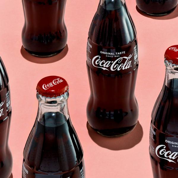
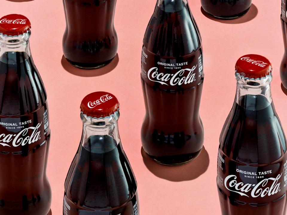
The aim is to create a signature sensory cue that distinguishes one brand from the rest – think of the iconic shape of the Coca-Cola bottle, or the look and feel of the Jif lemon juice packaging – as well as enhancing the consumer’s experience of the product.
It is becoming increasingly clear that people’s feelings about a given product are very often influenced by their response to the packaging. One of the classic examples of the power of packaging comes from studies on wine. It has been shown that people tend to prefer wine from cork-stoppered rather than screwtop bottles, even if they can tell no difference under blind tasting conditions.
Similarly, even though the bag-in-a-box represents a more sustainable form of packaging, people experience wine sold this way as tasting different – inferior, in fact – to the same wine served in a cork-stoppered bottle.
Weighted packaging for quality
In some of our own observational research, we were able to demonstrate a correlation between the weight of a wine bottle and how much you pay. By analysing several hundred bottles in an Oxford shop, we found that for every extra pound that you pay for a bottle of wine, you get an average of eight grams more glass.
Astute marketers, of course, are already on to the potential benefits of adding weight to packaging to indicate quality. In fact, I have heard that the correlation between price and weight is even stronger in the case of lipstick (another product, note, with a size that is essentially fixed).
The Power of Weight
In our research over the past decade or so, we have found that adding a small weight to everything from boxes of chocolates to cans of fizzy drinks results in people rating the contents as being of higher quality and, in the case of edible products, likely to be more satiating. It even affects our perception of scent. Our researchers documented a 15 per cent increase in perceived fragrance intensity when a handwashing solution was presented in a heavier container. Little wonder that perfumes are still so often sold in heavy glass bottles.
The challenge of light-weighting
This is a particularly interesting challenge for designers, given recent moves towards light-weighting, and even eliminating product packaging wherever possible. As such, a number of researchers are currently trying to figure out whether they can use other cues, such as colour, to give the psychological illusion of weight to their product packaging.
Interestingly, many studies conducted over the years have demonstrated that white or yellow objects tend to feel lighter in the hand than black or red ones of equivalent weight. That said, it is currently unclear whether it may be saturation rather than hue, per se, that is the key factor.
To have and to hold: The importance of grip
Aside from weight, we tend to prefer products that we find easier to grasp, or even to imagine grasping, slightly more than other products whose packaging we find it harder to imagine picking up or engaging with.
Packaging designers take advantage of this by creating affordance points (clues about how the product should be used) that improve grip or add texture, such as the indentation on many roll-on deodorant cans.
Some brands then place important details, such as the brand logo, near this point, as the eyes usually precede the hand when picking up an object.
A brand’s ‘signature feel’
Beyond the weight and affordances of the product packaging, the next thing to consider is how it feels to the touch – is it rough or smooth, for example? Does it have the feel of a specific material?
A few years ago, the plastic packaging of Velvet toilet tissue was treated to give it a luxurious, velvety feel. Similarly, Heineken created a distinctive feel on its beer cans using a special tactile coating technology, which created ‘drops’ resembling the condensation that appears on a can in the fridge. With one’s eyes closed, say, or when feeling around in the bottom of the ice bucket, it would still be possible to identify the Heineken can from all of its smooth competitors.
"It’s worth noting, as well, that embossed labels or crests on the front of bottles and cans serve to encourage the customer to pick up the packaging in order to feel the texture."
Finally, there is the firmness of the packaging. Research in the USA demonstrated that whether a drinking vessel was flimsy or firm influenced how a soft drink was rated.
Putting these various factors together, the combined differences in weight and firmness may help to explain why so many people believe that beer and Coke tastes better out of a glass bottle than from a can. Research we conducted with Andrew Barnett of Barney’s Beer at the Edinburgh Science Festival demonstrated that simply knowing that a beer had been poured from a glass bottle was sufficient to make people say it tasted better than a glass of beer that they had seen poured from a can instead.
In conclusion, therefore, it seems that the weight, texture/feel, compressability and temperature of product packaging are probably all much more important determinants of the customer experience than people generally realise. And, as such, it is probably high time that we all wake up and feel the packaging.