Why print design is changing fast – and what that means for designers working with today’s brands
The pandemic has influenced a lot of things in marketing – including the way designers are working with print.
Print design is always shifting, with new trends brewing and emerging into life. However they manifest themselves, they always have something to say about the creative industry and about the wider world. Of course, for 2022 we can throw the pandemic and the latest global tensions into the mix. How will the disruption, distress, frustrations and pent up energies – along with the new ways of living and working that have evolved – register in the design world in the coming months?
How the Covid-19 context has influenced graphic designers
Dana Arnett, CEO of creative agency VSA Partners (whose clients have included Google, IBM and Nike as well as Sappi) believes that the unpredictability of the pandemic has changed our whole way of living and working – and influenced how designers think and create. “History shows us how societal change and events directly impact design and vice versa,” he says, pointing to the age of modernism and functional design that followed the destruction of the second world war. Arnett is also in no doubt that design can make a positive difference :
“The most skilled and ethical designers are trained to understand change and to create meaningful solutions that take into consideration societal shifts and their psychological antecedents. Put more simply, creating meaning and making sense of change is where design will always find its place of difference.”
Six print design trends to watch out for
Here we bring together a selection of the primary trends for 2022 and take a look at what post-pandemic design might look like – and how it will influence the culture at large.
1. Minimalism design
Print designers are unlikely to ever give up on minimalism. Right now it’s the driving force behind logos, as brands ditch 3D-ness and flatten logos out (which is handy for digital uses) or just simplify what they already have. Eric Park, motion designer at design agency Collins, whose clients include Twitch and Spotify, believes that simple symbol-based systems are stronger than wordmarks.
"A great symbol can contain a more unique personality, carry rich metaphors and deliver meaningful references for a brand. A concise and simple symbol can be easy to instantly memorise”
2. Anti-design
In contrast, and perhaps as a reaction to the neatness and harmony of minimalism, so-called subversive design or anti-design embraces an anything-goes attitude – colours, fonts, shapes that clash or look wrong together, throwing out templates and notions of balance. It’s a challenge to the gatekeepers of design and according to Wednesday Krus, design director at award-winning creative agency ThoughtMatter, it pushes you to question your own practice as a designer or as a user. There will be no sticking to the old ways, following a consensus that “flattens ideas”, she says. Instead, subversion will set ideas free.
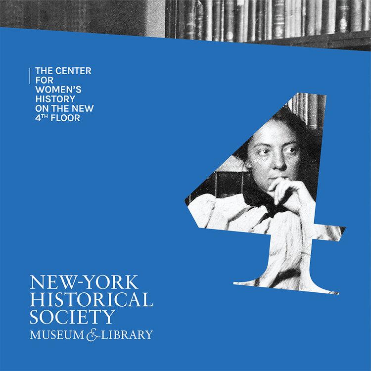
Work by the creative agency Thought Matter for the New-York Historical Society
3. The 1990s
Call it retro, call it nostalgia or call it a renaissance but the 90s are back. In particular, the bright, gaudy aesthetics of the early internet provide inspiration for a more jagged, more raw approach. Julius Colwyn, associate director of Space Doctors, a UK agency that has done work for Nike, Alexander McQueen and O2, says: “It comes as a reaction to an increasingly harmonious, consistent graphic style defined by too many brands and businesses.” As a result, things will get edgy, with “jarring collage, sharp contrasts, powerful neon and irregular frames”.
In a similar vein, drawing on the MTV of the 1990s self-consciously taps into a nostalgia for a time when, pre-internet and YouTube, the music station acted as a cultural nucleus for teens and young adults. (As well as playing music videos, MTV shows such as The Week in Rock provided global entertainment and celebrity news, while Beavis and Butthead supplied catchphrases and became 90s archetypes.)
June Frange, design director at CPB London, who have done campaigns for PayPal, Glenlivet and Carlsberg, has been utilising old-school idents and lurid green-screen graphics in order, he says, to bring “back a feeling of couch surfing nostalgia of home entertainment, for our mainly millennial audience.”
4. ‘Gig collage’
While not necessarily retro in look, ‘gig collage’ draws on the chopped up, pasted-together look of vintage punk and grunge. It’s a mood that will especially be relevant if 2022 sees the pandemic finally receding and the full return of nightlife, concerts and festivals. “This choppy, jaunty technique will bring more energy and movement to poster artwork, tickets, and flyers,” says Grace Fussell of Blue Whippet Studio in Manchester.
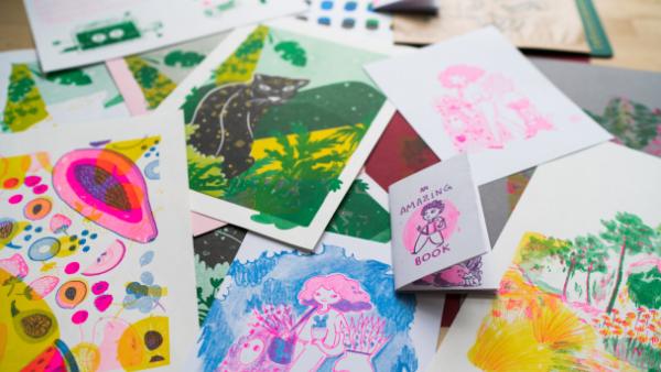
This low-fi mood, a riposte to the perfect digital hi-definition image, is also apparent in the revival of Riso art. The printing technique (now usually produced digitally) provides vibrant graphics with a DIY feel to them. The original method relied on creating a layered image (with one layer for each colour used) – and because these would never perfectly line up the result was always something unpredictable, with a homely, amateur feel.
5. Sustainability
Finally, environmental concerns are increasingly important to consumers, especially younger demographics (a 2020 study showed Genzers are willing to pay more for sustainable products and 62% of them prefer to buy from sustainable brands). Gone are the days when a splash of green would signify eco credentials. Now, brands are taking a bolder attitude to identities or fostering a genuine connection with nature. Designers will also need to think about the materials they are using – from the kinds of paper to the inks and finishes. Are they properly sustainable, with a low or zero carbon footprint?
6. Joining the dots
Back to Dana Arnett of VSA Partners for this. “Design’s heightening influence will only work when it functions in tandem with the challenges we face in today’s hyperconnected world,” he says. Creatives should be looking to see how design links to technology, business, ecology, social justice and to a better world. “Some call this the purpose of design. I think of it as the ‘evolving ecology of design’ – and it signals a great future for our creative community.”