Colour Management Technical Brochure
What makes a white paper white? It all comes down to light. Visible light waves are categorised by length, and the length of the wave determines the colours we see. Violet wavelengths, at about 400 nanometres, are the shortest and red wavelengths, at about 700 nanometres, are the longest waves of the visible light spectrum.
White light contains all colours. So what makes a paper white is, in effect, its ability to reflect equal amounts of red, green and blue light – the entire visual spectrum. It is really less a matter of being ‘white’ than of containing all colours.
A truly white paper reflects the entire visual spectrum in equal amounts. The more white, the higher the degree of colour reflectance and the greater the possible spectral range. The lower the whiteness, the less complete the spectrum of reflected light, which can result in dull, lack-lustre appearance.
What will I find inside this technical brochure?
Master the colour management process for your printing projects with tips, practical examples and valuable content covering topics such as light and colour, measuring paper shade, optical brighteners and much more.
Contents:
- Chapter 1: Light and colour
- Chapter 2: What is colour management?
- Chapter 3: Colour reproduction in practice
- Chapter 4: How Sappi helps manage colour
- Chapter 5: Sustainability
Get a sneak peak of Chapter 2 below.
Chapter 2: What is colour management?
From real apple to digital apple and to printed apple
There are three main colour management problems facing the printing and design industry:
• Dealing with the disparity between RGB and CMYK modes
• Calibrating digital devices so that images can be reproduced reliably, regardless of which device is used
• Widening the gamut to make the world of print more vibrant and spectacular while making sure that print conditions still match the colour gamut of the digital file
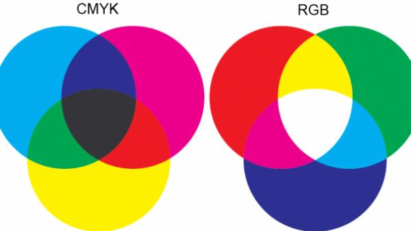
CMYK (subtractive) or RGB (additive) colour formation
In the days before the introduction of digital technology, everyone, by default, worked in approximately the same colour space. The photographer took the picture and sent off a film transparency that became the ‘master’ for the designer, prepress and printer to match down the line.
Nowadays those involved in the colour management workflow work without an actual physical ‘master’. When a designer opens a digital file of a photograph, it may or may not look like the image the photographer saw through the lens. The problem is that digital devices handle colours as numbers, and every device has its own particular way of reading them.
So without colour management at each step, what a camera records as greenish may be interpreted as yellowish on a computer screen, come out as purple on an office laser printer and print bluish on press.
This is exactly why there is a need for universal colour management, to be able to achieve the exact matches that hardware and software producers, printers, and others have been striving for ever since the first days of digital graphic communication, launched by Macintosh®. This is still as important today as it was back then.
Back in 1993, when digital technology was still relatively new, a number of software and hardware companies saw problems looming on the horizon and joined forces to form the International Colour Consortium (ICC). The goal of the committee was to establish crossplatform standards for colours in order to facilitate consistent communication between devices.
In developing a colour management programme, the ICC adopted the numbering system for colours first created by the Commission Internationale de l’Eclairage (CIE) in the 1930s.
This CIE L*a*b* colour space was used to define an ICC profile describing how a device reproduces colour. The profile information is embedded in the software, so when you open a file, the device knows how to render it for its own particular colour space.
Since different devices do not share the same gamut, the ICC developed the Colour Management Module (CMM) to interpret and convert colour data using ICC profiles. When CMM encounters a colour in a file that cannot be converted from one colour space to another (i.e. out-of-gamut), it compares the two devices and picks a colour value that is the closest match. This method works fairly well in most cases, but it still requires careful proofing by the designers to ensure that nothing important is lost in the transition.